Overview
A family hub simplifying daily life by combining tasks, reminders, and a shared calendar, all in one place.
Goal
Both clean and intuitive, this design is meant to keep things organized while feeling easy to navigate for all ages.
Approach
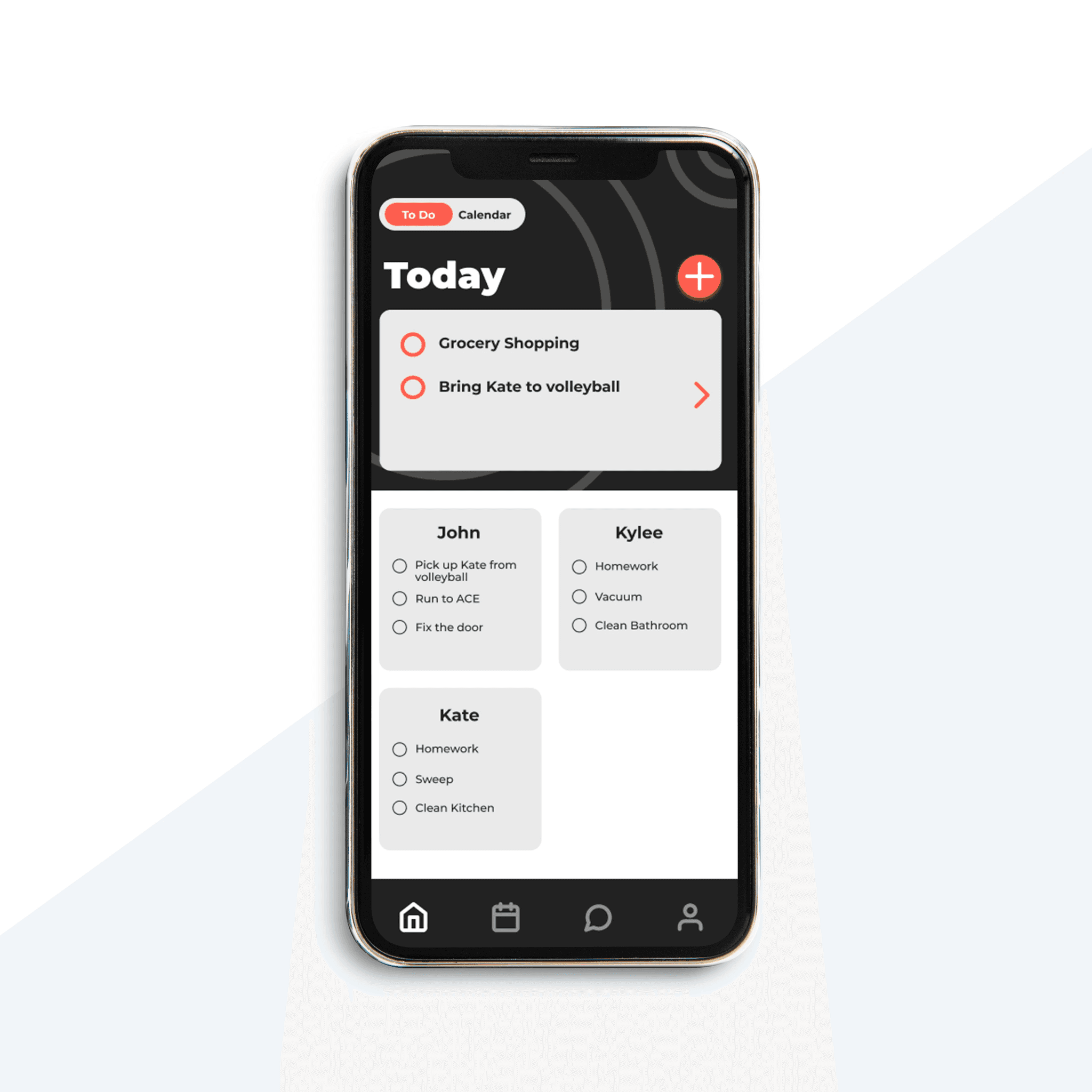
The app features a guided modal for adding tasks, with optional subtasks, assigned users, and scheduled dates and times. A red and black palette reinforces the focused, productive feel, while the typeface, often seen in UI design, allows the app to feel familiar. The linework pattern symbolizes organization and tying up loose ends, reflecting the brand’s core purpose, keeping your family in the loop.