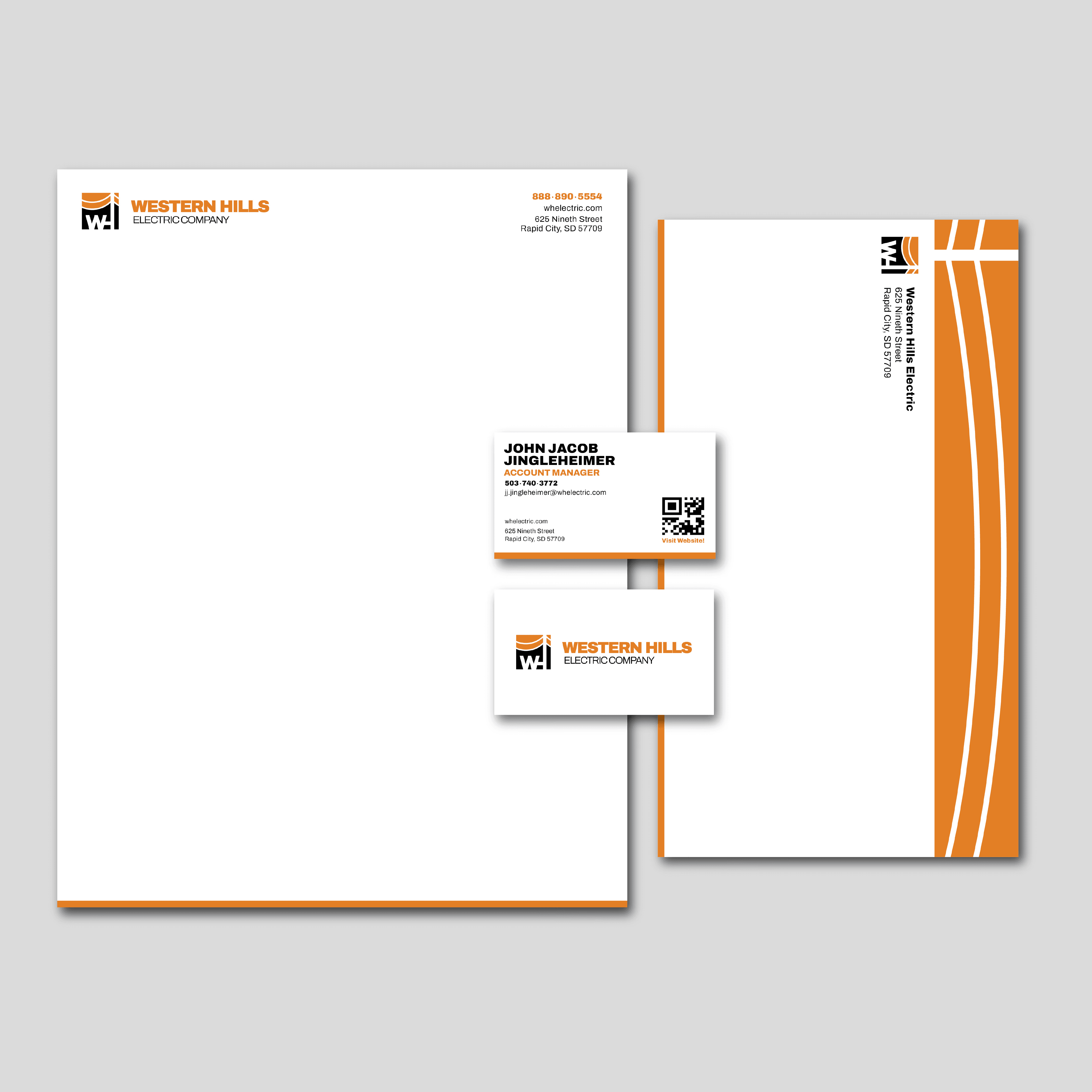
Overview
This brand identity, created for an electric company merger extends across various sizes and print formats.
Goal
To create a system utilizing repeating elements to reinforce the brand identity and increasing brand recognition.
Approach
Repeating elements like the footer, horizontal logo, and the strong alignment frame the composition. Consistent margins reinforce the geometric structure and bold identity of the brand, reflecting the company’s reliability and ingenuity. The abstracted power line pattern communicates the service they provide as well as the company's innovative approach to delivering energy.